PrintWorks – Resume Writing Tips

We’re celebrating International Update Your Resume Month this September with some great resume writing tips as well as suggestions to help you design a resume that will stand out to hiring managers. So whether you’re hunting for a new position, or just want to freshen up your resume with your latest experience and achievements, read on for our tips and tricks!
Resume Writing Tips
Check spelling and grammar
- Don’t just use spell check, ask a friend to take a look as well. It can be easy to overlook a simple mistake when you’re too busy focusing on the bigger picture of trying to explain your capabilities. A second pair of eyes is always a good idea.
Keep it simple
- Research has shown that employers only look at a resume for about 6 seconds, so make every word count by being concise and clear.
Focus on relevant information
- Only list the skills and experience that are relevant to the job you are applying for. Employers don’t need to know about the very first job you had in high school, especially if that job is completely unrelated to where you are applying.
Make sure you have a professional email address
- Make a good impression and make it easy for employers to contact you. Try to stick to your name without too many extra numbers or special characters.
Give descriptions of the company
- A brief (2-3 sentences) description of the company can help an employer understand your experience.
Resume Design Tips
You don’t need a lot of bells and whistles to stand out. Simple is better, especially for a resume which should be easy to read. But that doesn’t mean you can’t add some personality to it. Focus on fonts, hierarchy, and layout. These three simple tools, if used correctly, can add more visual interest to a resume without going over the top.
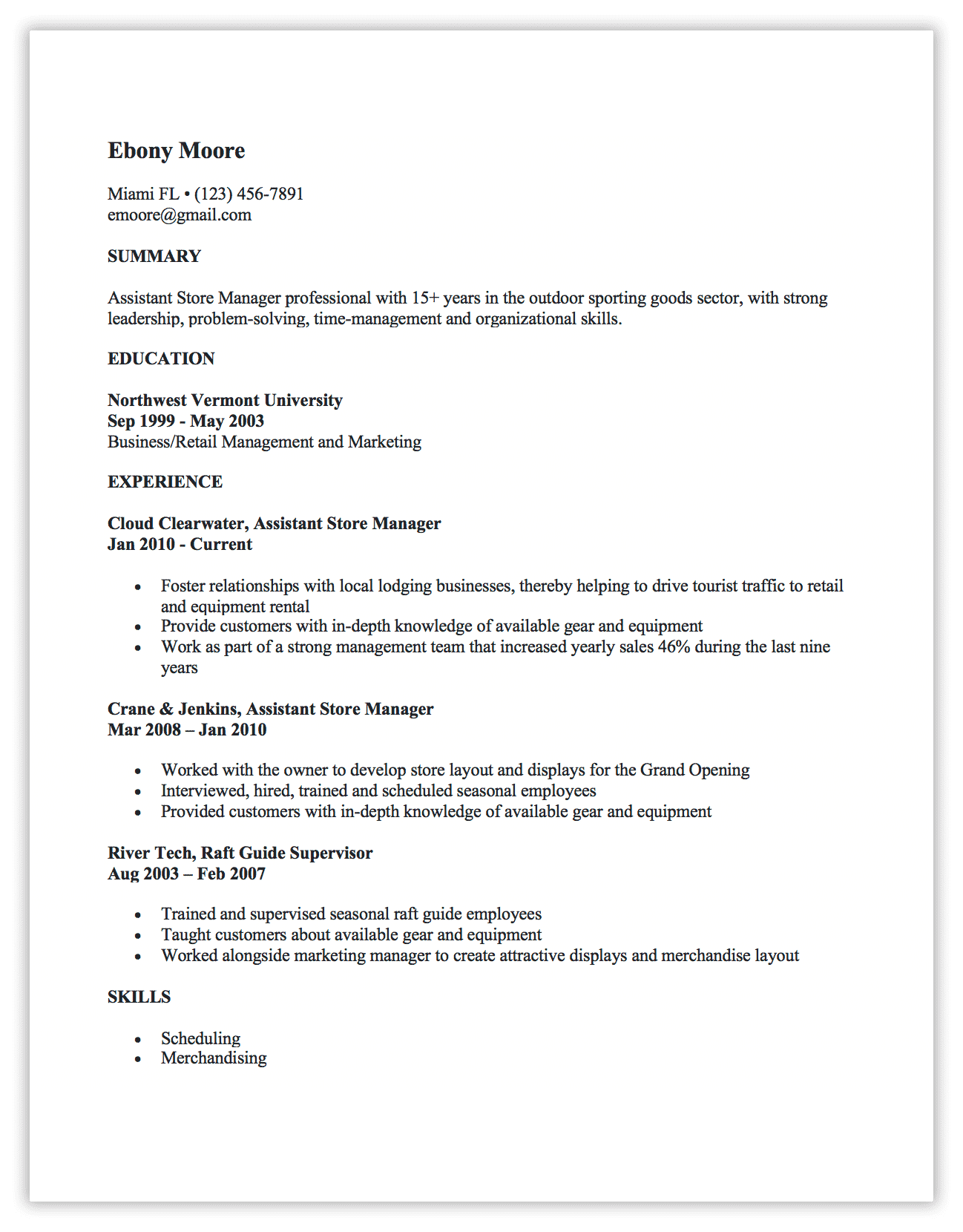
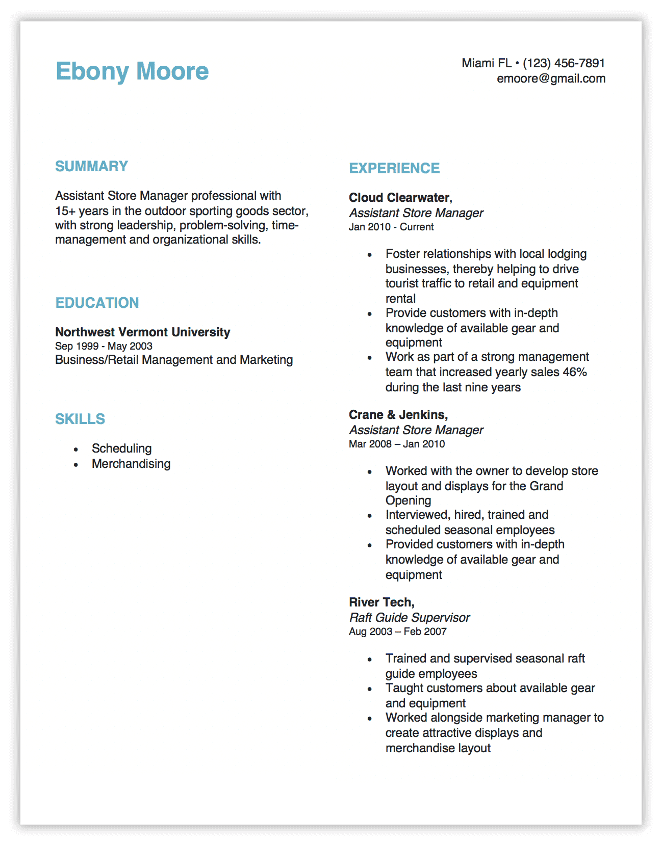
See two samples below. Both have all the same information, just presented differently. The second sample is still simple, but it is easier to read and more visually appealing than the first example.
Font Choice
- Pick a clean, simple font. Stay away from anything too “fancy”. Try to go for a classic option like Arial, Helvetica, Times New Roman, Calibri, Georgia, Avenir Next, or Garamond. These tried and true fonts are popular for a reason, after all.
Font Size
- The recommended font size for heavier areas of text (like job descriptions and dates) is typically 12 points, and should never be less than 10.5 points. Go bigger to create hierarchy for headers and job titles (see next point)…
Hierarchy
- Hierarchy helps draw the reader’s eye to the information that will help them easily spot what they are looking for. Use font size, styles (like bold, italic, or all caps), and colors to separate different levels of information.
- Look at the difference in the examples below. If you’re looking for “experience”, it’s easier to find this section in the second example where the title is larger, all caps, bold and in a different color.
Layout
- Splitting your page into multiple columns can make the more dense areas of text easier to read. When a column spans from one end of the page to the other, the reader’s eye has to move farther. A smaller column width can make it easier to read and create a cleaner layout. See the example below with two columns.
Before:

After:

Part of designing your resume is choosing the right paper to print it on so it has a professional quality. Our Professional Paper is the perfect choice when the time comes to print your new and improved resume. The quality, weight and laid finish of the paper add the perfect touch.
If you want to go the extra step, you can also use our Business Cards to help make a good first impression.
Follow us @printworksdiy on social media for more craft inspiration, and visit our Store to check out the rest of our product line.


